AI Prototyping: How 11 Real-World Teams Are Transforming Their Work with Lovable
If there’s one AI tool that should be impacting your product discovery work right now, it’s AI prototyping.
Tools like Lovable, V0, Bolt, Replit, Base44, and Magic Patterns feel like magic. They make it easy to spin up an interactive prototype in minutes. It’s incredible.
If you haven’t tried any of these tools before, I strongly encourage you to do so. They are great for testing assumptions, prototyping full solutions, and even building real products (in limited situations).
I’ll be doing a deep dive on my own experience with two of these tools down the road. But for now, I want to share with you 11 real-world stories about how product teams are integrating AI prototyping into their workflow today.
These stories focus on Lovable—one of the fastest-growing tools in this space. But the lessons can be applied with any of the AI prototyping tools. So feel free to use your tool of choice.
As always with our Tools of the Trade series, Lovable had no input on this story nor was I (or Product Talk) compensated in any way for featuring them. I’m simply a fan and wanted to help spread the love.
My goal is to inspire you to give these tools a try and to share many examples so that you don’t have to figure it out on your own.
Read through the stories and let me know which ones resonated with you. If you are reading this article in email, just hit reply. Otherwise, reach out on LinkedIn or X.
1. Rapid Prototyping: How Dany’s Team Used Lovable During a High-Stakes Design Sprint
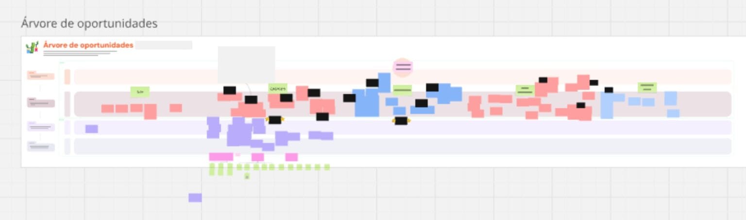
At a startup, constraints often lead to creativity. That was certainly true for Dany Mucheroni, a design operations lead who also wears a research ops hat. Recently, she found herself leading a high-visibility design sprint at her company with a clear goal: increase paid conversions by reimagining the onboarding experience.
“We had visibility from the business area and the board,” Dany explained. “We needed to move fast.”
Her cross-functional sprint team included product managers, designers, engineers, and representatives from business, customer experience, and support. While six core contributors drove the day-to-day sprint activities, more than 40 people were consulted throughout the process. That’s not a typo—40.
From Opportunity Mapping to Onboarding Redesign
The design sprint began the way many good discovery efforts do: with a shared understanding of the problem. Dany’s team sent out a company-wide form to understand how different departments defined "onboarding." That process helped them build a shared opportunity solution tree focused on the journey from sign-up to first value.
“Our platform is for digital signatures,” Dany said. “But we noticed that people were dropping off before even experiencing the core value of the platform.”
The team hypothesized that rethinking the onboarding flow—prioritizing early engagement over formal steps—could help improve initial retention.
Where Lovable Came In
As the team explored potential solutions, they ran a Crazy 8s session to generate a wide range of ideas. But choosing among them wasn’t easy.
“We hit an impasse after voting on our Crazy 8 ideas,” Dany said. “So we started researching AI tools to help us prototype. That’s when we brought in Lovable.”
Lovable let them quickly turn raw sketches into interactive prototypes—fast enough to test ideas before momentum stalled. One of Dany’s teammates used Lovable to create a clean, minimal interface inspired by the team’s desired onboarding aesthetic. They then integrated those screens into Miro, turning them into interactive click-throughs to get early feedback from stakeholders.
“Lovable gave us a starting point,” Dany said. “We liked the path it created—it matched the minimalist vibe we wanted.”
The team kept iterating from there, creating multiple variations of the flipped onboarding concept. Lovable helped them visualize their ideas quickly, allowing stakeholders across the company to weigh in early. That early feedback proved critical.
What Didn’t Work
As useful as Lovable was, it still had its limitations.
“We still had to go to Figma and start to iterate,” Dany explained. “Lovable couldn’t help us solve the dashboard problem. The AI just built what it was fed, based on existing data.”
Lovable was great at turning ideas into tangible prototypes, especially for flows like onboarding. But once the team shifted their focus to a cluttered, complex dashboard, the tool fell short. The AI didn’t have the nuanced understanding of their data architecture or customer behavior needed to simplify and restructure the interface.
In those cases, the team had to fall back on more traditional tools—like Figma—for detailed design work.
Speeding Up Discovery Without Sacrificing Depth
The sprint ran for five days—though as Dany joked, “It was a Brazilian version of a sprint,” meaning it didn’t follow the book exactly. Still, within that short window, her team was able to go from idea to aligned concept, thanks in part to the rapid prototyping enabled by Lovable.
“We’re still working on the final prototype now,” she shared during the interview. “We’re setting up usability tests with key people in the company. It’s still new here, this kind of approach, but we’re trying.”
Lovable didn’t just help Dany’s team move fast—it helped them move together. By generating tangible, testable versions of their ideas, they were able to bring in feedback from across the organization without bogging down the process.
Why It Worked—and Where It Fell Short
There’s a lot we can learn from Dany’s approach:
- She used an opportunity solution tree to frame the sprint. This ensured the team was solving a meaningful problem, not just running with ideas.
- She didn’t wait for pixel-perfect designs. Lovable helped her create “good enough” prototypes to test and iterate.
- She involved a wide range of stakeholders. From marketing to support to engineering, everyone had a voice.
And perhaps most importantly: “We wanted to deliver value fast. Lovable helped us prototype quickly so we could get there,” said Dany.
But she also knew when to switch tools. Lovable helped get early alignment and explore concepts quickly—but it wasn’t a substitute for detailed design work when they needed to wrangle a complex dashboard.
That’s the right mindset: Use the best tool for the job.
2. Prototyping the Future: How Moritz Uses Lovable to Explore Short and Long-Term Concepts
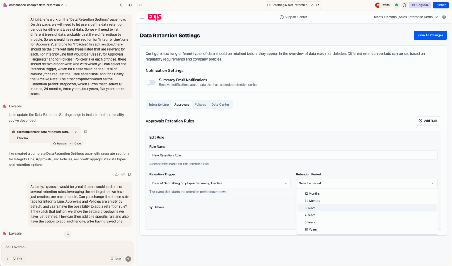
When I spoke with Moritz Homann, Director of Product Innovation and AI at EQS Group, he was clear about the role Lovable plays in his discovery process: It's not just about speed—it's about clarity. He told me, “I think the first thing that I created and put in front of customers was kind of a new area in our main platform for data retention management... It took maybe an hour or something, which would have traditionally taken a week.”
EQS Group is a B2B SaaS company headquartered in Munich, and Moritz’s team focuses on what’s next—greenfield initiatives, AI opportunities, and long-term visioning. That forward-looking work requires tools that can move fast while keeping stakeholders aligned. For Moritz, Lovable has become a key part of that toolkit.
From Concept to Customer Feedback—In a Day
Moritz’s first serious project in Lovable was a prototype for a long-requested feature: data retention management. The concept had floated around internally for some time, but it hadn’t been visualized in a way that would make sense to customers. “We already had slightly fleshed it out conceptually, but not in a way that we could talk to customers about it,” Moritz explained.
Using a screenshot of the current platform, he prompted Lovable to create a new tab for retention rules, a table for overdue data, and a configuration area where admins could set custom retention policies. The result? A working prototype that made it easy for customers to engage.
“To them, it looked like it’s already live,” he said. “They already provided a lot of detailed feedback… what they liked, what they would love to see… Getting to that would have taken much more time.”
Visualizing Product Vision—Internally and Externally
Moritz isn’t just using Lovable for features on the near-term roadmap. He’s also using it to explore long-term ideas. One example: an AI-first reimagination of their platform. “We’re wondering: is there a version of our current SaaS platform that is more AI-first?” he said. “With Lovable, you can start getting something in front of you… even if it’s completely sci-fi or doesn’t make sense, maybe there’s something there that kind of makes sense.”
It’s a smart use case—tangible visuals are powerful in internal strategy meetings. As Moritz put it, “Ten people come together… everybody has a different idea of what they’re talking about. With a prototype, I can say, ‘This is what I see.’” That shared visual language accelerates alignment.
Working with Lovable: Tips and Tactics
Over time, Moritz has refined his process for working with Lovable. His approach is methodical and practical:
- Start with screenshots: He prompts Lovable to replicate part of the existing product UI before layering in new functionality. This grounds the prototype in reality and avoids hallucinations.
- Prompt step-by-step: “If you ask too much of it, it sometimes gets confused,” he told me. He learned to prompt iteratively—first the layout, then the table, then the configuration area.
- Use variable levels of specificity: For some elements, like tables, he provides exact column definitions. For others, like filters or tabs, he leaves it open-ended.
This balance between structured input and open-ended iteration helps him move quickly while still leaving room for discovery.
What Didn’t Work
Like many of us, Moritz ran into Lovable’s quirks. In particular, design fidelity issues were a concern: “For some reason, it sometimes puts the screenshot as the main company logo in the top left,” he laughed. Fixing those quirks became part of his standard workflow.
He also hit limits when trying to scale a prototype into something closer to production. When the design became too complex, making one change would break another. “That was probably the point where I should have started using Cursor or some other code editor,” he said.
Lovable excels at early-stage discovery—but it’s not a production environment. And Moritz was clear-eyed about that.
Reflecting on This Team’s Discovery Habits
Moritz’s story is a reminder that discovery isn’t just for what we’re building next—it’s also for what we might build someday. By using Lovable to prototype rough concepts quickly, he’s able to gather feedback, align stakeholders, and keep momentum going, even when a project is far off the roadmap.
Three practices stood out:
- Prototype before you’re ready: Moritz doesn’t wait until a feature is fully scoped. Instead, he uses Lovable to make ideas tangible early—whether for an upcoming sprint or a long-term vision.
- Visuals unlock clarity: Whether it’s getting customer feedback or aligning with internal teams, a shared visual language beats a vague idea every time.
- Iterate with purpose: His blend of specific and abstract prompting helps him strike a balance—staying open to what the tool might surprise him with while guiding it toward a clear goal.
As discovery teams, we often talk about reducing risk and accelerating feedback. Moritz’s work is a model of what that looks like in practice—and Lovable is helping him do it faster.
3. Validating Navigation Changes Without a Designer: How Claudia Used Lovable to Move Fast
When your designer is on vacation, your stakeholders are full of ideas, and you’re in the middle of re-platforming four legacy systems into one, how do you keep discovery moving? For Claudia Llapart, a product manager in the automotive sector, the answer was Lovable.
Claudia's team was building a new B2B platform to consolidate several legacy tools—each with different menus, features, and users. “We knew the general structure,” Claudia explained, “but we were given a guide on how it should look, and we weren’t sure how much of it actually made sense for the people using it.”
That uncertainty led Claudia to create a prototype to test a new navigation structure. With no designer available, she turned to Lovable.
From Legacy Menus to Lovable Prototypes
The platform Claudia was working on functions a bit like SharePoint: users upload, organize, and retrieve documents—catalogs, reports, and technical content. One big pain point? Too many clicks.
“They were used to having a full page with one click to get a document. Then a new page, and another click. It was frustrating,” she said.
To reduce friction, Claudia reimagined the navigation. “We integrated more functionalities into one page. Instead of subsections in the menu, we used tabs,” she said. But she needed a way to test this idea quickly—with end users, not just internal stakeholders.
Lovable helped her move fast.
Prototyping Without a Designer
Claudia started by creating wireframes in Miro. “I didn’t want to start with an empty sheet. I already knew the layout—lateral menu, header, and the menu entries we wanted to test,” she said.
She uploaded those wireframes to Lovable and prompted it to generate a clickable prototype based on her design system. “We didn’t use our internal design system, but we used Material UI, which our system is built on top of. That meant the output would be implementable by our developers later,” she explained.
Even better, Lovable filled in the blanks with realistic content: tables filled with 15+ Excel files, dashboard data, and placeholder product names pulled from her context prompt. “I asked it to show Excel files for sales data in 2025, and it did it. That saved me so much time,” she said.
In less than five hours—an afternoon and a morning—Claudia had a functional prototype to test with users.
Getting Feedback with Realism (and a Bit of Help from Datadog)
To gather feedback, Claudia first sent the prototype to her internal stakeholders for review. Once they gave the green light, they shared it with end users.
She also wanted data on how users actually navigated the prototype—not just what they said. So she asked her tech lead to help her add a Datadog snippet. “It’s what we already use for screen recordings,” she explained. “With that, I could see heat maps, clicks, and how they navigated—even without setting up specific events.”
This combination of qualitative and behavioral data helped her identify sticking points in the new navigation. “At first, users had trouble finding things. But once they understood the new tabs, they completed tasks super fast,” Claudia said.
What Didn’t Work
Claudia was impressed by how quickly she could build and iterate—but Lovable wasn’t perfect.
For one, it required constant QA. “You have to check that it didn’t break anything when you prompt it. Sometimes I had to remind it to stick to the design system again and again,” she said.
She also didn’t feel ready to use it for final designs. “The components were good enough for testing, but not to go live. I knew we’d need a designer to polish it later,” she added.
Still, for rapid iteration and testing, it did the job.
What We Can Learn from Claudia’s Approach
Claudia’s story is a great example of discovery in motion. Even without a designer, she:
- Started with a real problem: “Too many clicks” wasn’t a stakeholder request—it was a pain she uncovered through early interviews and task analysis.
- Created just enough fidelity to learn: She didn’t waste time perfecting the UI. She prioritized learning if the new structure made tasks faster.
- Used real data for realism: Instead of lorem ipsum, she prompted Lovable to use context-specific content, which made it easier for users to engage meaningfully.
- Gathered behavioral evidence: Adding a tool like Datadog helped her understand not just what users said, but what they actually did.
- Brought stakeholders along: She got internal buy-in before testing with users—critical when your stakeholders are your gatekeepers.
And perhaps most importantly, she didn’t wait for perfect conditions. “The designer was on vacation,” she said. “But I still had to test.”
That’s the kind of scrappy, practical discovery that moves teams forward.
4. Diving Into the Backlog: How Jared Used Lovable to Bring an Old Idea Back to Life
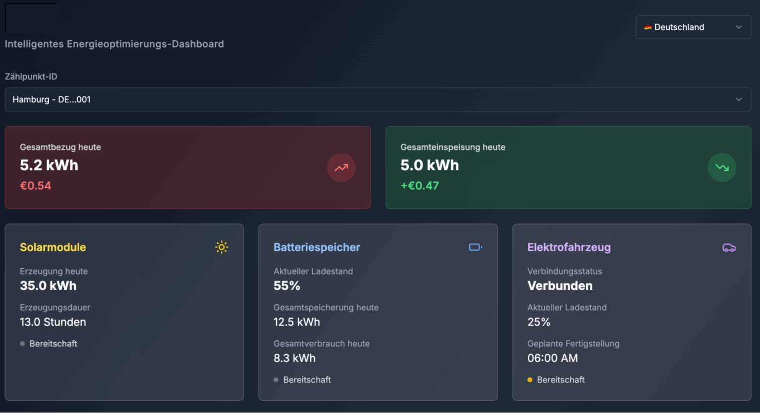
Jared Stephens found that he kept encountering the same customer problem—proactively identifying students at mental health risk. But he didn't have enough time to build anything out to address it until he started experimenting with Lovable. Click the image to see a larger version.At TimelyCare, a teletherapy platform serving over 400 colleges and universities, Jared Stephens leads the product design team. Like many product and design leaders, Jared runs generative workshops to tackle validated customer problems with cross-functional partners. These workshops often yield strong ideas—but turning those ideas into testable concepts can take time.
One idea, generated back in November, kept resurfacing. “We had some really great ideas come out of that workshop,” Jared said. “But then those ideas kind of got put to the side because we didn't have time to actually build anything out.”
Then, Lovable entered the picture.
Revisiting a Dormant Idea with a Fresh Toolset
Months later, when the same customer problem came back up—how to proactively identify students at mental health risk—Jared saw an opportunity. “My boss was saying, hey, could we maybe prototype something up?” Jared recalled. “I was like, ‘Give me the weekend.’”
Rather than starting with wireframes or paper prototypes, Jared turned to Lovable. “I want to give you something that’s a lot more interactive,” he explained, “not production-ready, but believable enough to put in front of a customer and get a better signal from them as to if this is a real thing.”
In just six hours, Jared built a fully interactive concept test.
From Concept to Clickable in a Weekend
Jared’s prototype simulated a two-sided experience: an administrator interface for sending out a mental health prompt, and a student interface for responding. The system would then analyze the sentiment of the student’s response using a large language model (LLM), assign a risk score, and return it to the admin dashboard.
This wasn't a simple mockup. Jared connected the prototype to a real LLM for sentiment analysis and even used Supabase to simulate a functioning backend. “That sentiment analysis working with real responses—that was something I could never do in Figma,” he said. “Could never do in paper prototyping.”
By Monday, he had a demo-ready prototype and a short video walk-through to share with internal stakeholders.
Too Real? The Risks of High-Fidelity Prototypes
Jared’s colleagues were so impressed that they thought the product was ready to ship.
“The response I got was, ‘Okay, when are we shipping this?’” Jared said. “I had to say, ‘Hold on. This is so far from production.’”
The prototype was visually polished enough that it caused confusion about its stage of development. To mitigate this, Jared switched from sharing the clickable prototype to a 90-second video walkthrough for internal review.
Still, the high fidelity had its advantages. “When it feels real, they are able to identify real risks,” he said. For example, one potential customer flagged a key issue: Their institution doesn’t communicate with students via SMS—the proposed delivery method. “I don’t think I could have gotten that with a paper prototype,” Jared reflected.
What Didn’t Work
Lovable still had some limitations. Jared ran into challenges with Supabase as his backend scaled. “When I first started logging in, it took half a second. By the end, it took 25 seconds,” he said. He attributes this to rushing through Supabase setup. “If I was trying to do this for production, I’d be a lot more careful.”
He also found some front-end flexibility constraints. While he managed to build a convincing interface, tweaks—like simulating SMS delivery or fully integrating real backend data—were still finicky or time-consuming.
The prototype wasn't meant to be shippable, but it was good enough to raise eyebrows—and meaningful questions.
Reflecting on the Process: What We Can Learn
Jared’s story highlights what good discovery looks like in the real world: messy, opportunistic, and high-impact.
Instead of letting a good idea die on the vine, he revived it with a fast, interactive concept test. And by using Lovable, he got from “we should test this” to “here’s something we can test” in a single weekend.
Three practices from Jared’s approach are worth emulating:
- Revisit ideas that didn’t make it out of past workshops. Discovery is iterative. The right moment might come later.
- Use Lovable (or similar tools) to build testable concepts quickly. Aim for believable, not perfect. Realistic interaction helps stakeholders and customers engage more deeply.
- Match fidelity to audience. High fidelity can unlock richer insights, but set expectations carefully—especially internally.
This is how teams make discovery lovable: not by perfecting every detail, but by staying nimble, bringing ideas to life fast, and getting real feedback while it still matters.
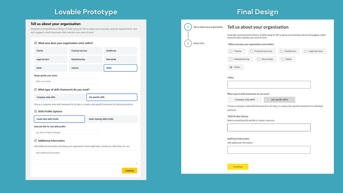
5. From Concept to Live Feature: How Phill Used Lovable to Ship Quickly

At Kallidus, a learning and performance platform, Senior Product Manager Phill Lord-David faced a familiar challenge: a vision too complex for words alone. “We’re building a lot of new capabilities,” Phill told me. “We’ve got a two-year roadmap and our design team is under constant pressure to stay ahead.”
With new functionality in the works—particularly around AI-driven skill frameworks—Phill needed a way to help customers understand not just what was live, but where the product was heading. And he needed it fast.
“I was almost scribbling down concepts on a notepad and holding it up to the camera. That’s when I discovered Lovable,” said Phill.
Showing, Not Telling
Phill’s first use of Lovable wasn’t just to prototype a net-new feature. It was to reconstruct a feature that already existed—an AI-powered skills generation tool—so he could layer on an enhancement that customers had been asking for.
“We were getting consistent feedback that users wanted to generate skill profiles not just for the company, but by department or job title,” he explained. “So I rebuilt the existing feature in Lovable, then added the enhancement.”
It took him all of five minutes and four prompts to recreate the existing UI. From there, he iterated on the enhancement—adding a toggle for job-specific frameworks, a prompt for role details, and a flow to generate suggested skills and group them into profiles.
“It was actually the first feature we ever built that didn’t have finalized designs,” Phill said. “We used Lovable to show the engineers what we meant.”
Rather than waiting on Figma mocks, they gave engineers the Lovable prototype and a written breakdown in DevOps. “We told them, ‘Use your judgment. If something doesn’t match our component library, use what you know.’”
The approach worked. “There were a few bumps,” he admitted, “like one component that didn’t match our design system, or needing to clarify how to reuse an existing search field. But it was all sorted with a 15-minute call.”
Aligning Fast—Internally and Externally
This prototype didn’t just guide development. It helped Phill quickly align with stakeholders, including designers and other product teams.
Before sharing with engineers, Phill looped in his designer. “We work in trios—PM, tech lead, and designer,” he said. “I showed him the prototype and we went back and forth, adjusting things like layout and copy together in Lovable.” Even when they didn’t agree with a change, they could easily roll it back using Lovable’s restore feature.
The designer ended up joining the experiment too. “Now he’s using Lovable to explore A/B variants of a complex feature,” Phill said. “It’s letting him run faster, especially when there are multiple directions we want to test.”
What Didn’t Work
For all the speed Lovable enabled, there were still limitations.
“Simple formatting stuff tripped me up more than complex flows,” Phill said. “I spent an hour and ten prompts trying to get text aligned correctly inside a graph. Sometimes it said it fixed it—but it hadn’t.”
He also noted some quirkiness around graph components and suggested that highly custom UI still benefits from manual tweaking or switching to other tools.
And while Lovable helped convey the concept, it didn’t eliminate the need for design fidelity. “Once we had buy-in, we still recreated the UI in our actual design system,” Phill said. “Lovable helped us align on the right direction. It didn’t replace the need for designers or the need for final designs.”
A Smarter Way to Test Ideas
This wasn’t just a clever hack—it changed how Phill’s team works. The skills feature went from concept to live product with unprecedented speed. “We made the decision to build it two weeks before our roadmap lock,” he said. “Now it’s already out and in use.”
Even better? The prototype became a long-term asset.
“Lovable is helping us validate ideas for features we won’t launch until six months from now,” Phill said. “We can show a rough concept to customers today and start collecting feedback now—before we’ve even written a PRD.”
What We Can Learn
Phill’s story is a great example of practical, real-world discovery. His team didn’t follow a textbook process—but they did the things that matter:
- They got concrete fast: By turning ideas into prototypes, they reduced ambiguity and sped up alignment.
- They involved others early: Designers, engineers, and stakeholders all contributed to shaping the solution.
- They tested iteratively: Instead of over-investing in one polished version, they started rough and evolved from feedback.
- They treated prototypes as thinking tools: Not just something to show at the end, but something to build with.
Lovable didn’t do the work for them—but it helped them work faster, collaborate better, and get to the right answer sooner.
“I’ve never been blown away by an AI product as much as I was with Lovable,” Phill told me. “It’s not perfect. But it let us move at the speed of thought.”
And in discovery, that might be the biggest unlock of all.
6. Working on a Side Hustle: How Marie Explored a Side Project in Record Time
When I spoke with Marie Phillips, a principal product manager based in Melbourne, she was in the thick of building a new idea—not for her day job at a legal tech company, but for her family’s e-commerce business. It wasn’t a feature request or a minor optimization. It was a whole new tool: a synthetic user research platform powered by AI.
Marie had an itch. Her husband, the founder of their side business, was rebuilding their website—but had no interest in doing any user research. Marie, ever the product thinker, wanted to test the new site before launch. But what if AI could simulate users and generate qualitative feedback on its own? She decided to find out.
And thanks to Lovable, she was able to go from concept to interactive prototype in just a few hours.
Exploring a New Idea
Marie described the motivation clearly:
“I thought that would be a really cool thing to have access to. Let’s say it’s a dollar a user, and I could just go, I want 500 users to throw at this website in half an hour so that my husband doesn’t go live without any… major issues on it.”
Her idea was to simulate human behavior on a website, using AI agents that could navigate pages, identify friction points, and return insights like, “What surprised me?” or “What made me want to abandon this experience?”
Before building the back-end logic using orchestration tools like n8n and OpenAI, she turned to Lovable to prototype the customer-facing interface.
Starting Fast, Then Iterating
Marie had experimented with Lovable before, but this time, she went deep. She started with a simple prompt describing her idea—a tool that would let someone deploy synthetic users and view their feedback in a dashboard.
But her first output was underwhelming: “The UI was too minimal. It just didn't feel like the output had my end goals in mind.”
Rather than give up, she took a different approach. She began “hacking away” at it with iterative prompts—adding missing pages, adjusting the layout, and incrementally layering in design inspiration.
One especially creative technique? She uploaded screenshots of apps she liked and told Lovable to use them as visual references: “It took it from boring-as-batshit to something that actually felt a little bit warmer and a bit nicer,” said Marie.
A Tool to Think With
While she initially prompted Lovable casually, Marie later began using more structured requirements—often using a one-page product brief she created in Claude. In some cases, she even asked Claude to write “high-fidelity design instructions” for Lovable to follow. That pairing made her Lovable prompts more effective and reduced friction in the design process.
In total, she spun up multiple project versions, restarted when context got muddy, and eventually arrived at a clean, usable prototype.
“I feel like I’ve got what I need from the front-end perspective in order to test. I’m really, really happy with it—like I’m delighted with how well it’s turned out,” said Marie.
What Didn’t Work
Lovable wasn’t perfect. At several points, Marie ran into limitations with layout customization and style consistency. When designs got too complex, the tool occasionally froze or struggled to apply changes: “It got stuck a few times… I had to get more specific in how I was prompting or just say, ‘Your changes haven’t had an effect.’”
She also noted that Lovable prototypes didn’t always reflect her desired design fidelity—especially when working with real branding: “The first draft… it didn’t embody the feeling of this 80% prototype that I was trying to get to.”
To compensate, she used other tools like Claude to write prompts, and planned to transfer the final design into Figma later if needed.
What We Can Learn
Marie’s story is a great example of what good discovery looks like when you're working solo, on a budget, and in exploratory territory:
- Start scrappy, then refine. Marie began with quick prompts and gradually layered in structure. That let her test ideas quickly without over-investing up front.
- Use tools in combination. Lovable wasn’t her only tool—Claude helped her shape ideas, n8n powered the backend logic, and Playwright was under consideration for web automation. The stack emerged organically, based on what she needed at each step.
- Anchor in real feedback. Her next step wasn’t more prototyping—it was user testing. She worked with the family business’s e-commerce manager to see if it met his needs.
- Know when good is good enough. This wasn’t pixel-perfect. But it was good enough to test, learn, and keep moving forward.
It’s a great reminder that product discovery isn’t just about process—it’s about momentum. And tools like Lovable can give solo PMs and side hustlers a huge boost in momentum when they need it most.
7. Exploring the Future: Helping Customers (and Stakeholders) Imagine What’s Possible
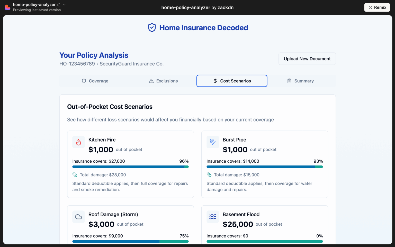
Zack Nolette, a senior product manager at LexisNexis Risk Solutions, works at the intersection of mobile apps, SDKs, and complex insurance data. His job is to figure out what to build next—often in a highly regulated and risk-averse environment.
Recently, his team was exploring how to help homeowners better understand their insurance coverage. Through interviews, they uncovered two major sources of confusion: first, homeowners didn’t know what kinds of risks their policies covered, and second, they often couldn’t make sense of the policy documents themselves.
“We were literally talking with homeowners who had their policies in front of them and they’re like, ‘I don’t know what this means. What is this?’” Zack said. “It became obvious that even just interpreting these documents is a real problem.”
Turning Research into Prototypes—Fast
Zack saw two directions they might explore: one, a low-risk option where the app would show homeowners generalized risk information about their geographic area; and two, a higher-risk option where the app would interpret and explain their actual policy documents using AI.
He built Lovable prototypes for both.
“I just said, ‘Hey, I want a website with these three or four steps. Here's the kind of data I want to show.’ And Lovable cranked out a beautiful prototype. It took like five minutes,” Zack told me.
The more complex of the two—a website where users could upload their policy PDF and receive a personalized explanation—came together shockingly fast. In a few prompts, he had a working experience that included a document upload, mock AI interpretation, and personalized risk insights.
The second prototype, a geo-based risk email template, proved trickier. Zack wanted specific design elements, like sliders and icons for different risk scores, and ran into some of Lovable’s limitations.
“The more specific you get about the visuals, the harder it gets,” he said. “It took me a couple hours of going back and forth to get that one looking right.”
Still, the speed and flexibility of Lovable allowed Zack to get both ideas in front of stakeholders—before involving engineering or design.
Bringing Prototypes to Stakeholder Conversations
As luck would have it, the company had an upcoming customer advisory meeting where they’d be talking to representatives from top insurance carriers. Normally, Zack might have shared a few slides or talked through the concepts.
Instead, he shared live prototypes.
“I gave the links to one of the folks running the meeting and they were like, ‘Wait, how did you build this so fast?’ And I had to explain,‘No, this isn’t real. It’s just a prototype.’”
The prototypes gave stakeholders something concrete to react to. That mattered—a lot.
“It felt more real. They got to see a version of the product and give feedback on how it worked, not just the idea,” explained Zack.
Zack said it helped ground the conversation in the right level of fidelity. Not too polished, not too vague. Just enough to help people imagine what the experience could be.
What Didn’t Work
Like everyone else, Zack ran up against some challenges with Lovable. The biggest one? Visual consistency and control.
“One section was a completely different style from another section. I wanted everything to look and feel the same across the whole email,” said Zack.
He also struggled with map integrations—API keys, thumbnail previews, and other details became a time sink. And while Lovable let him create prototypes quickly, it didn’t always support the kind of granular customization he wanted.
“My designer’s reaction was basically: ‘This is great and terrible at the same time.’ It’s ugly, but it helps us move fast,” Zack explained.
Ultimately, they decided not to show the prototypes directly to users. It was enough to align internally and rule out a few directions.
What We Can Learn from Zack’s Approach
Zack’s story is a great example of using just enough fidelity to make discovery faster and clearer.
Here’s what I love about how he approached this:
- He built for divergence. By prototyping two very different solutions, Zack explored the space widely—then tested how customers and stakeholders responded to each.
- He made the ideas tangible. Whether it was homeowners or insurance carriers, people were able to react to the concept more thoughtfully because they could see and click through something.
- He right-sized fidelity. Zack didn’t let the imperfections of Lovable stop him. For internal conversations, visual polish wasn’t the point. Tangibility was.
If you’re wrestling with a fuzzy opportunity—or trying to bridge a gap between what users need and what stakeholders will support—this kind of rapid, messy prototyping can go a long way. You don’t need to get it perfect. You just need to help people imagine what’s possible.
8. Interactive Pricing Calculators: How Melissa Used Lovable to Untangle Packaging Decisions
As a fractional CPO, Melissa Firth is no stranger to navigating high-stakes strategic decisions with limited time and resources. Over the past 18 months, she’s led packaging initiatives at several software companies—work that often involves aligning stakeholders across product, sales, marketing, and engineering.
Recently, Melissa started using Lovable to accelerate this work. In two very different companies, she used the tool to create interactive pricing calculators that helped stakeholders align quickly—and served as real assets in sales conversations and customer testing.
Here’s how it worked.
Packaging Is a Team Sport (with No Natural Owner)
Melissa first encountered the messiness of packaging while leading a similar project a few years ago. At the time, she didn’t have a tool like Lovable and the work was slow and fraught. As she put it: “There is no one natural owner for packaging, especially in companies that don’t have product marketing. So it falls to someone like me to pull together product, sales, marketing, and engineering. It’s a multi-stakeholder, multi-party team sport.”
That early project involved months of wrangling. So when she stepped into a similar challenge at a new B2B SaaS company—this time with a product marketer on board—she knew she wanted to try a different approach.
They’d been spinning on a new pricing and packaging model for months. Then, her product marketing partner proposed an idea: instead of mocking something up in Excel, what if they built an interactive pricing calculator in Lovable?
“He just sent me a link in Slack and said, ‘Excel is so yesterday.’ It was a beautiful calculator—and suddenly, all the conversations we’d been stuck in started moving forward,” said Melissa.
The sales team started using the prototype right away in customer conversations. As they worked through different deal configurations, they could screen share and show the customer exactly what the pricing would look like—instantly making the new model more tangible and trustworthy.
“They’ve actually started using that Lovable calculator in their sales calls. It makes the whole thing seem more trustworthy because it’s beautiful. The output is beautiful.”
Applying the Same Playbook in a New Market
Melissa took what she learned from that project and applied it to another company—a 40-year-old AgriTech platform based in New Zealand. This time, she led the packaging initiative herself, using Lovable from day one.
This company had a single published price despite clear differences in customer segments. They were about to expand into Australia, and Melissa saw an opportunity to test a more nuanced model. After months of foundational work—product analytics, customer segmentation, competitor research—she used Lovable to build a prototype pricing page.
Here’s how she approached it: “I started with a prompt that went: ‘I am creating a new pricing page for my Agri Inc company. I want to have three tiers at this price. I want to call these tiers these things. I want these features to be in those tiers. I want a feature comparison table. I want a pricing calculator that has a value metric. This is the value metric…’”
The first prompt got her most of the way there. From there, she iterated using Lovable’s interface—refining components, adjusting behaviors, and making incremental improvements.
The final result was a compelling prototype that showed how the new pricing could work across tiers and customer types. She used it to align internal stakeholders, and she’s now preparing a version (with prices removed) for Van Westendorp willingness-to-pay testing.
What Didn’t Work
Melissa had a few moments of friction. At one point, Lovable broke the layout while trying to refactor her design. She got it back on track by prompting it to diagnose its own error and create a plan to fix it—a workaround that worked surprisingly well.
“I asked it to diagnose what’s wrong and come up with a plan to fix it. Every time I did that, it managed to rebuild successfully,” explained Melissa.
To prepare for implementation, Melissa handed off the Lovable prototype to a designer to create a Figma version using their official design system. She’s also planning to explore Lovable’s Builder.io integration to test a Figma-to-code workflow.
What We Can Learn from Melissa’s Approach
Melissa’s story is a powerful example of how Lovable can accelerate discovery—even for messy, strategic problems like packaging.
Here’s what stood out to me:
- She started with real business goals. This wasn’t about playing with a new tool. It was about increasing deal size, improving margins, and preparing for new markets.
- She used the prototype to align stakeholders. Instead of debating in abstract, Melissa put a realistic prototype in front of her team. That’s what moved the conversation forward.
- She kept things lightweight. In both cases, she used Lovable to get just-enough fidelity to validate the model—then handed off to design for production-quality work.
- She iterated quickly. Melissa isn’t precious about her prompts. She experimented, deleted, restarted, and tweaked until she got what she needed.
- She treated it as a learning tool. “I’m trying things,” she told me. “I’m delighted with how well it turned out.” That mindset—curious, exploratory, outcome-oriented—is at the heart of great discovery.
If you’re exploring something messy—like packaging, onboarding, or pricing—I hope Melissa’s story gives you the confidence to try prototyping sooner. You don’t need perfect inputs. You just need a place to start.
9. Addressing Regional Constraints: How One Student-Led Team Used Lovable to Win Demo Day
In a recent senior management program, Princess Edo-Osagie and her team set out to solve a challenge many communities in Africa face: group coordination beyond WhatsApp. What they created—a prototype of a niche community app built in Lovable—did more than fulfill their course requirements. It won their program’s demo day competition.
As Princess put it: “In Africa, not everybody has email. Phone numbers are more prevalent.”
That simple observation shaped not just their design choices but also how they used Lovable to validate and showcase their idea.
The Context: Community Beyond WhatsApp
Princess lives in Lagos, Nigeria, where many social and alumni communities rely heavily on WhatsApp for coordination. But WhatsApp wasn’t built to manage rosters, events, or subgroups. Princess and her team saw an opportunity: a mobile-first app tailored for managing African communities—with alumni groups as their initial focus.
Their concept included a phone number-based signup (instead of email), user verification via OTP, and cross-community collaboration. Princess, who’s worked as a QA, DevOps engineer, and now product manager, took the lead on building the prototype.
From Notebook Idea to Interactive Demo
Princess first heard about Lovable through a post on LinkedIn. She was immediately hooked.
“I just brought out my notebook and decided to try it out. It gave me the first look of what it could look like. I kept prompting it,” said Princess.
Her initial prompt was simple: “Give me a mobile app for an alumni community where users can connect and share.”
That was enough to get started. But as Princess iterated, she got more specific—especially around onboarding.
“The default was email and password. That doesn’t work for my users. So I told it, ‘I want to sign up with mobile, and I want OTP verification,’” she explained.
She integrated Twilio for OTP, and even began connecting the prototype to a backend using Supabase.
“I don't have to stress any database engineer anymore,” she said. “The APIs were created. It was really remarkable for me—just those moments.”
When Supabase integration became unstable during the sprint, Princess pivoted. She stripped it back to a clickable prototype and prioritized speed and reliability for demo day.
Gathering Feedback at Speed
Princess’s role was to build the app; her teammates focused on user research. They tested the prototype with themselves and with members of real alumni communities.
“Seeing it suddenly brought it alive to people,” Princess said. “There were a lot of requests for additional things to be added.”
It’s a classic moment in early discovery—when people see a real prototype, feedback sharpens and ideas multiply. Princess worked late into the night updating screens in Lovable so her team could return to users with something new the next day.
Demo Day Storytelling
The team didn’t just show up with an idea—they told a story.
“Other teams had fantastic ideas,” Princess said, “but I think it was the storytelling that got us over the line.”
They used AI to help polish the narrative, then created videos of their prototype in action. The combination of clear storytelling and a concrete demo helped them win.
What Didn’t Work
Lovable gave Princess speed, but not polish.
“I think for some people it’s fine,” she said. “But for my taste? It wasn’t good enough to go live.”
She brought in a designer after the course to take the vision further and plans to explore converting designs from Figma into Lovable via Builder.io. She also ran into some early issues with two-way syncing between Lovable and GitHub, and had to abandon her Supabase integration for demo purposes.
“Sometimes it would integrate, then there would be errors. It would try to fix it, but you’d burn your tokens and it still wouldn’t be resolved.”
What We Can Learn from This Team’s Discovery Approach
Princess’s story captures what great discovery looks like: fast feedback loops, real-world testing, and a prototype that evolves with the team’s understanding of the problem.
Here are a few takeaways:
- Start with what you know. Princess had a clear picture of her users’ needs. That gave her a strong first prompt.
- Iterate quickly, but precisely. She didn’t just accept Lovable’s defaults. She tailored onboarding for her local context.
- Let others own the feedback loop. By dividing responsibilities across her team, Princess kept building while others gathered user insights.
- Storytelling matters. A working prototype is great. A compelling narrative around it is what wins hearts—and competitions.
Lovable helped this team move from idea to interactive prototype without writing code, hiring a developer, or waiting weeks for design help. That’s the kind of tool we need when discovery is fast, messy, and high-stakes.
“For prototyping, for discovery, for just getting ideas out and testing them,” Princess said, “this works super.”
10. Standing Out in the Job Search Process: How Matt Used Lovable to Show His Ideas
It’s not every day I hear about someone using Lovable to support a job application. But that’s exactly what Matt Smith did. When applying for a product manager position at a UK-based energy startup, he built a prototype—using Lovable and Supabase—to show how the company could scale internationally.
He built a working prototype that illustrated a critical scalability challenge the team would likely face in the near future.
“I thought, what better way to show I understand the product space than just having a think: what sort of thing are they going to be looking to fix over the coming months? How could I show them something that they might not have?”
Reframing the Challenge with a Scalable Lens
Matt had been following this company for a while. He knew they were growing, and a recent job listing for an “international associate” hinted at global expansion. From experience, he understood the complexity of localizing energy products across different regulatory environments.
“The pricing for electricity in the UK is the same for the whole market. But in Germany, they divide the country up into sections, and there are different prices. So how is that going to be handled by the tech they have if they want the app to look and feel the same?”
His solution? A backend-for-frontend (BFF) architecture that would hide regional complexity behind a standardized UI. But rather than pitch it with slides, Matt wanted to show it in action.
Building the Prototype in Lovable
Matt started in Vercel, a tool he had used before, but quickly hit a wall: “It was really going to struggle to show the backend and frontend interplay. Lovable, on the other hand, had this integration with Supabase. I realized I could show the same UI, but with region-specific data flowing in from different tables.”
With some market research and three CSVs of mock data, he created region-specific database tables in Supabase. Then, using Lovable, he generated a working UI that pulled from those tables. A dropdown let the user switch between Germany, Spain, and the UK, showing how the app’s interface stayed consistent while the data changed underneath.
His first prompt got him 80% of the way there. He wrote: “I want to build a product that will cover this market with these features. I need to be able to handle different underlying data based on these three tables in Supabase. Can you build me an app for desktop that will pull from those tables, but look the same?”
From there, he iterated—about 30 prompts in total. Some refinements were cosmetic. Others dealt with tricky bits like localized language. He ran into some snags: “It would say, ‘Okay, I’ve applied that change,’ but the text would still be in English. Eventually I said, ‘You haven’t done it,’ and it reviewed its own code and fixed it. That was kind of amazing.”
What Didn’t Work
As polished as the final result looked, Matt still couldn’t get Lovable to work perfectly in every case.
“There was one section where it just wouldn’t update the translation. And there’s definitely a ceiling—at a certain point, the complexity causes things to crash or get stuck,” he said.
Matt also found himself bumping into Lovable’s limitations as a designer. “Once you want to get picky about exact spacing and color, you start spending more time fixing things than creating,” he noted. For a real product, he’d eventually need to hand things off to a front-end engineer or designer. But for this purpose? It was perfect.
A Bold Approach to Discovery
Matt never got to run this prototype past real users—it was part of his initial job application, after all. But he used the same practices I encourage in product discovery:
- Start with a real problem: He looked for opportunities in the company’s roadmap and market context.
- Get specific: Rather than pitching a vague idea, he built a working demo of a concrete solution.
- Validate feasibility: He explored different tech tools and ultimately found one that let him show backend and frontend interplay.
- Stay scrappy: He kept the scope narrow, iterated quickly, and focused on the learning goal.
This is the kind of product thinking we can all aspire to—whether you're interviewing, shipping a new feature, or exploring a fuzzy opportunity.
If you’re in a similar situation—trying to get buy-in, test a risky idea, or just get people to understand what you mean—don’t underestimate what a quick prototype can do.
“Even if it’s only 80% of the way there, the fact that people can see it and interact with it and talk about it? That’s everything,” said Matt.
11. Comparing and Contrasting: How Aarthi Used Lovable to Explore Multiple Product Ideas Quickly
Aarthi Shankaran is a technical product manager at a workforce management platform, where she works on the core engine that powers customer-specific configurations and calculations. Earlier this year, her team faced a familiar challenge: internal stakeholders needed a way to clone configuration templates quickly—something that had the potential to drastically reduce project setup time and customer implementation costs.
They had an idea. But they needed to move fast. They needed feedback. And they needed a prototype.
That’s where Lovable came in.
“From idea to user validation, it just took us 11 days,” Aarthi told me. “And we were already able to define product requirements, the scope, even the designs. It’s now in the hands of our engineering team.”
The Problem: Long Setup Times for New Projects
The team had discovered a pattern: They were repeatedly configuring the same types of customer setups from scratch. It was clear that cloning existing templates could dramatically improve speed and efficiency.
“Let’s say we have a new retail customer in the UK,” Aarthi explained. “You could simply clone a template of UK retail configurations we already have. This could reduce setup time by up to 75%.”
The idea was solid. But the workflow wasn’t yet defined, and the product team needed a fast way to test options.
The Discovery Process: AI-Accelerated and Rapid-Fire
Because the tool was for internal users (the project teams themselves), Aarthi could gather feedback quickly. Her team started by conducting interviews and mapping out workflows. Then they moved into prototyping.
“Using Lovable, we created several prototypes and tested them with internal users. It was incredible how fast we could iterate,” she said.
Aarthi didn’t just test one idea—she tested variations.
“Would users prefer to see a list of existing templates immediately? Or would they rather search? We created different versions to test these assumptions,” Aarthi explained.
Lovable made that possible: “It took me all of two hours to build one prototype. I just had to prompt it with the pages and workflows we’d learned from research. Then we could put it in front of users.”
They used a mix of usability testing styles: structured walkthroughs and open-ended exploration. The results helped the team refine their direction fast.
“Some designs weren’t intuitive—people were stuck or confused. Others worked great. Based on that feedback, we picked a direction and moved ahead,” Aarthi told me.
What Didn’t Work
As smooth as the process was, it wasn’t perfect. Lovable’s output was intuitive, but not brand-consistent. That was fine for internal tools, but Aarthi noted she wouldn’t use it directly for customer-facing prototypes without further polishing.
“If I’m validating early ideas, Lovable is perfect. But when we need to test something with customers, we export the design into Stitch, then into Figma, where we use our design system to make it feel more like our actual product.”
She also acknowledged a learning curve: “Earlier in the year, it would take me seven or eight hours of trial and error. Now, it takes one—because I know what prompts to use.”
And sometimes, she still prefers to prototype in Stitch instead of Lovable, especially when handoff to engineering is involved: “If it has to go to engineering, I use the same prompts in Stitch to generate wireframes. That gives us clean handoff assets.”
What We Can Learn From Aarthi's Approach
There’s a lot to admire in Aarthi's story, but a few discovery habits stood out:
- Start with real research—even when it’s internal. Aarthi's team didn’t skip the fundamentals. They interviewed internal users, mapped workflows, and used that data to shape their ideas. Even with fast AI tools, discovery still starts with listening.
- Prototype to learn, not just to build. Rather than jumping straight into one idea, Aarthi's team generated and tested multiple variations. That allowed them to spot friction points early and avoid assumptions.
- Use the right tool for the right stage. Aarthi isn’t dogmatic about her tools. She uses Lovable to prototype quickly and Stitch when she needs something more polished. And she knows when to skip the visual fidelity altogether.
- Let AI do the heavy lifting—with your guidance. Aarthi doesn’t treat Lovable as a black box. She guides it with clear prompts. And when she wants more structure, she turns to Claude Sonnet to help shape her requirements before sending them into Lovable.
“If I’m not worried about layout or branding—if I’m just validating the idea—Lovable gets me there fast,” said Aarthi.
Whether you’re prototyping an internal tool or an ambitious new product, Aarthi's story is a great reminder: Speed doesn’t have to mean skipping steps. With the right discovery habits—and the right tools—you can move fast and stay grounded in your users’ context.
Are you inspired? Give one of these tools a try and let me know how it goes. If you are reading in email, just hit reply. Otherwise, leave a comment on LinkedIn or X.
Comments ()